The assignment
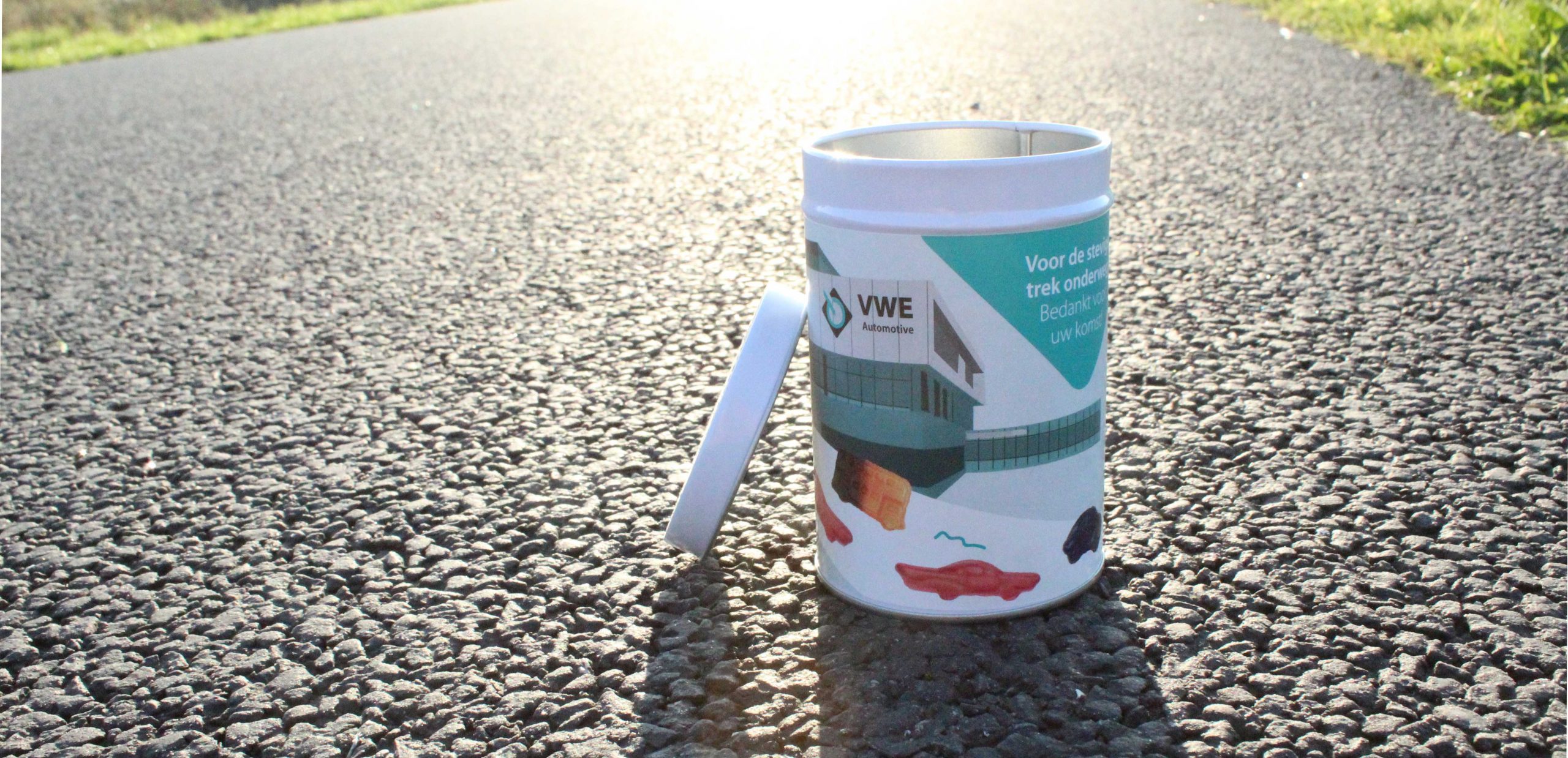
VWE Automotive wanted to give customers a piece of memorabilia, so they asked me to design a can of liquorice. Fittingly, VWE chose a type of liquorice in the form of cars and busses, called autodrop.
The realisation
Before I started with the design, I looked at the style of autodrop itself, because I thought it nice to continue this style in the cannister. For this I used the art style of autodrop and the brand colours of VWE Automotive.
At autodrop there’s always a white road over which the liquorice pieces drive, with illustrated buildings in the background. Seeing as this was a parting gift for customers, I wanted to put an illustration of the company itself in the background, as if they were driving away from the building. I did this in Adobe Illustrator. After I added the liquorice cars on the white road, the image was complete.
Finally, I used the diamond, typical of VWE Automotive, as a textbox for the fitting text: ‘Voor de stevige trek onderweg. Bedankt voor uw komst!’ which roughly translates to ‘For the hungry traveller, thanks for coming!’